Do you tend to choose your home colour schemes based on pretty pictures you’ve seen on social media or in magazines, rather than considering how you want your room to make you feel then working outwards from there?

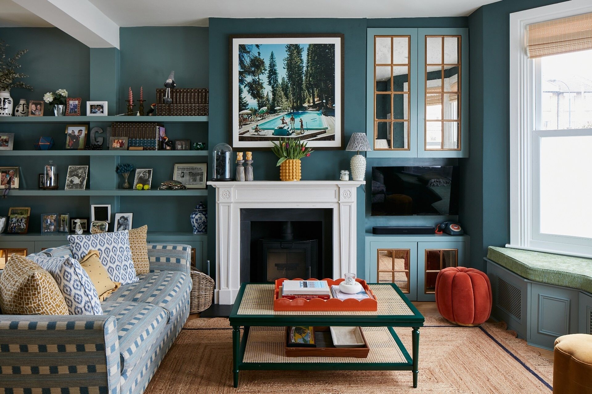
[Image credit] Colour can be a transformative tool in any space, so learn to use it to your advantage. This living room at our recently sold Hainault Road shows how it’s done.
Do you tend to choose your home colour schemes based on pretty pictures you’ve seen on social media or in magazines, rather than considering how you want your room to make you feel then working outwards from there? While this might be something of an alien concept, it’s actually a key consideration to make if you want to ensure you feel totally happy and at ease with the end result. And - of equal importance - it helps you avoid any costly mistakes which lead you to repaint, because the reality didn’t quite live up to what you thought it would, too.
Colour psychology – in essence, the way we process and assign emotions to different colours – is a pretty meaty topic, and can be informed both by our memory associations and subconscious cues our brain is picking up on. However, there are some basic universal rules which are useful tools to bear in mind when it comes to making these decorative choices.
Our resident interiors writer (who also covers this topic in her book, The New Mindful Home), Joanna Thornhill, has shared a few tips below to help demystify the topic:
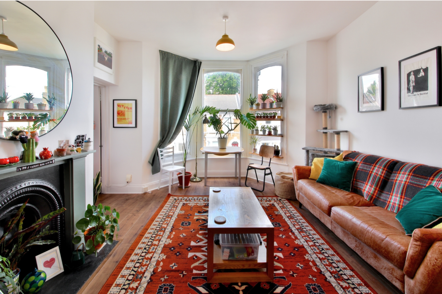
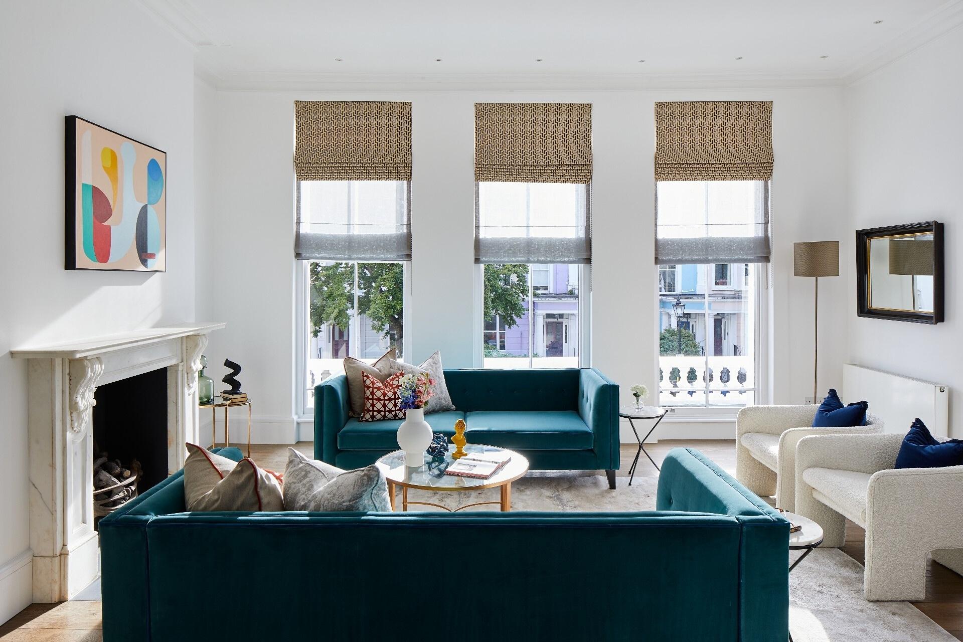
[Image credit] Concerned about painting your walls a bold hue, or worried how it might affect your resale desirability? Stick to white or neutral paints and bring through colour in rugs, throws and curtains, instead, like this recently sold living room at Mornington Road has done.
You might know what colours you like, but determining which ones to use, and what to pair them with, can feel overwhelming. Regardless of your taste or scheme choice, however, starting with exploring how you want the space to make you feel really can be a game-changer. So before you do anything, sit down and draw up a bit of a list: to help get you going, try visualising yourself in your finished space, but rather than imagining how it looks, concentrate on how you’re using it and what feelings and emotions it’s bringing up for you: is teatime with the kids feeling fun and full of laughter? Are you feeling creative and motivated in your home study? Does curling up in bed feel safe and cocooning? Colours can play a key role in helping steer these feelings.
Broadly speaking, cooler colours such as blues and greens are considered calming, while warmer tones such as oranges, reds and yellows are thought of as more stimulating and invigorating, but the quantity in which we use colour – and its saturation – plays a big part of the picture, too. Painting a bedroom, for example, in a floor-to-ceiling pillar box red might feel quite intense, yet on the more desaturated end of the scale, a very pale pinky hue would arguably feel a lot more rest-inducing.
Another way to consider this can be to choose a scheme which is either tonal, harmonious or contrasting. A ‘tonal’ palette would literally entail picking one main colour, then complementing this with tints or shades of that same base colour – so a sage green could be paired with a pale green tint then accented with a darker forest green, to produce a finished space with little friction and a calming feel. If you’d rather take things up a notch, a ‘harmonious’ scheme brings in the colours it sits next to on the colour wheel. So, that sage green could be teamed with blue or yellow, for a little more drama while still ultimately feeling fairly low-key. If that’s not bold enough, however, work with the opposite shade on the colour wheel (so in green’s case, red) to create a look that’s more bold and vibrant.
A rule of thumb among interior designers is to follow the 60/30/10 rule when it comes to colour: keep 60% of the space as your dominant colour, 30% as your secondary or neutral shade, then add 10% of a contrasting tone to liven things up a little.
Want to dig into a few key colours a little more closely? Here’s three examples, and how to use them:
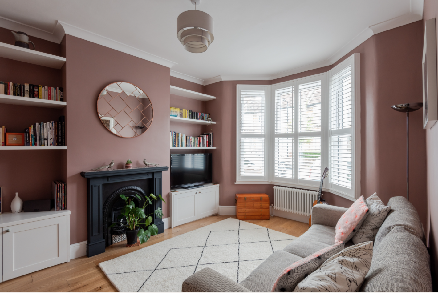
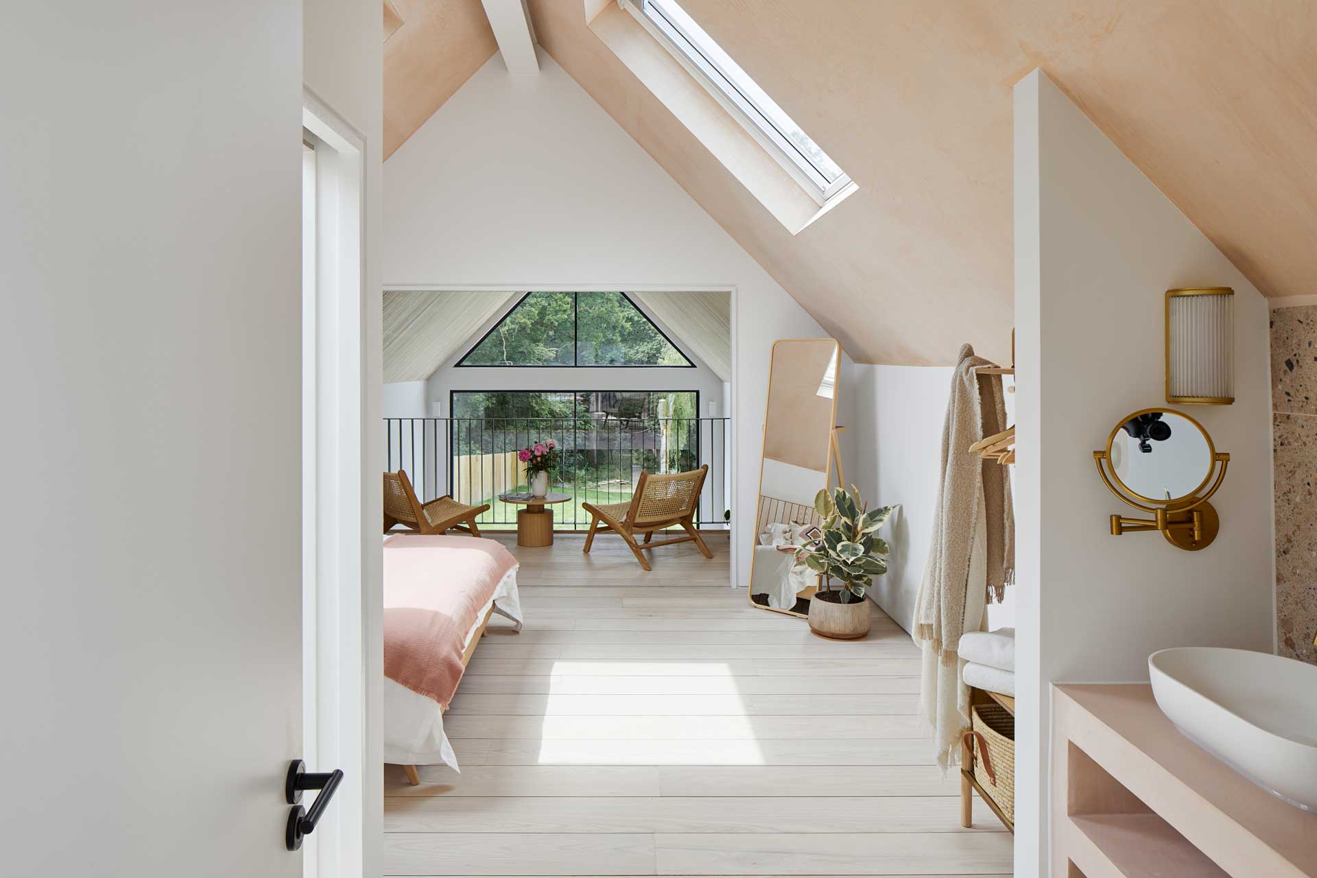
[Image credit] Pink certainly needn’t mean overly feminine – this sophisticated tone, in recently-sold Albert Road, has a grey base to it which stops it feeling saccharine.
1. Pinks for calm
Pink has definitely moved out of little girls’ bedrooms and into the mainstream (and our main living spaces) over the past few year. Acting almost as an antidote to grey-as-a-neutral, pink is said to be a soothing tone which can even help foster feelings of empathy and lower heart rates. While you might not be keen to paint your sitting room in a bright Barbie tone, more neutral shades such as putty, plaster and terracotta will still bring the same calming benefits (and be less likely to cause household controversy or put off potential future buyers, either).
Pinks can work well with sunset tones for a Mediterranean feel, or dulled with deeper berry hues for a more Autumnal look. Pairing with its contrasting colour, green, can produce a more vibrant scheme which still feels soothing overall.
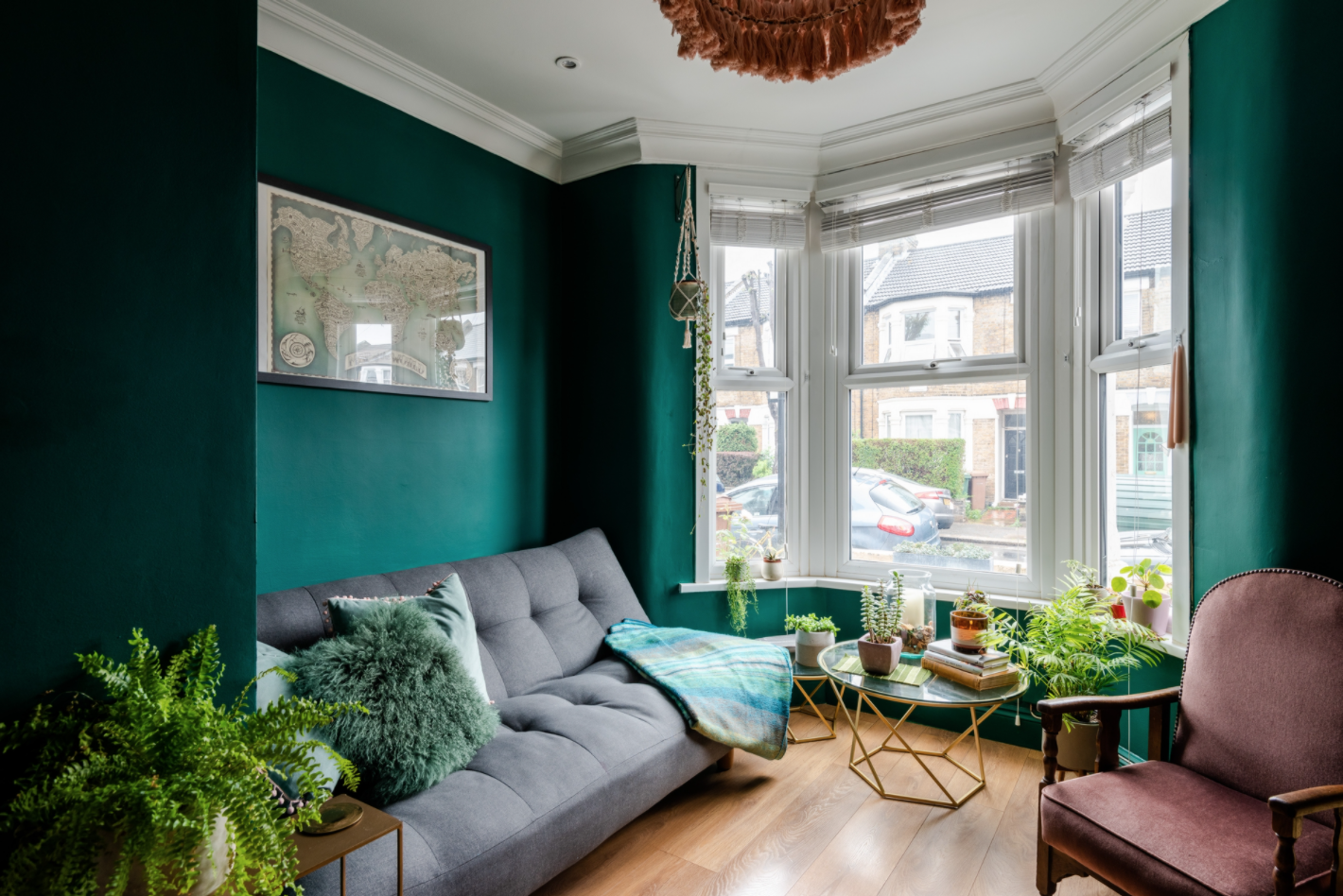
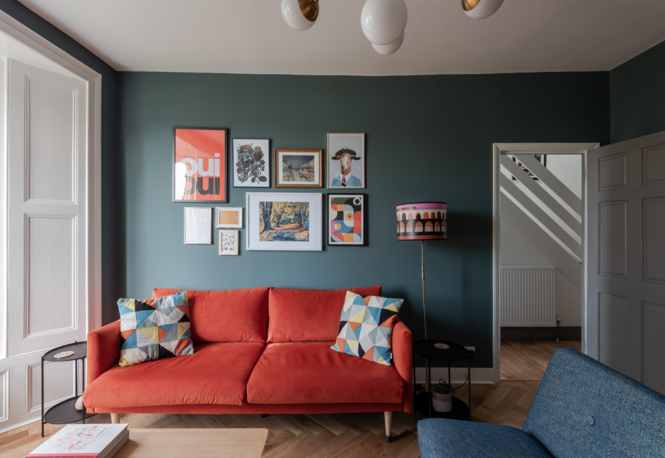
[Image credit] Green’s inherently relaxing tones make it a ‘safer’ colour to go bold with: this highly saturated deep green, featured in the main living space of recently sold Albert Road, has a definite cosy feel to it.
2. Blues and greens for restoration
Covering a huge range of tones and tints, blues and greens can create a balanced, restful scheme which is perfect for tranquility and relaxation. With its close connections to the natural landscape, blue is even said to help pacify the nervous system and is also a great choice for a bedroom, due to its ability to aid sleep through its relaxing properties. If your aim with these colours is to bring about peace and relaxation, avoid its more vibrant incarnations, such as lime greens or bright turquoise, which can be invigorating, or bring these tones into removeable items such as cushions and throws rather than your dominant wall colours, instead.
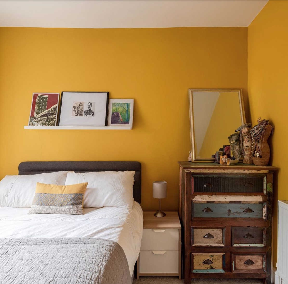
[Image credit] Consider vibrant colours carefully in the bedroom – too much might stop you getting to sleep – though on the flip side, it might also help get you going in the morning! The former owners of our Norman Road listing opted for this sunny yellow tone to create a lively feel.
3. Fiery colours for energy
The colours over on the warm side of the colour wheel – namely your reds, oranges and yellows – can be perfect choices for parts of the home where you need a little visual pick-me-up: for you this could mean in the kitchen, as a way to inspire you to be bolder and braver with your culinary choices, or even in a room or space used as a children’s play area or craft room. However, bear in mind that these hues can also feel overly stimulating or even irritating if you can’t ‘escape’ them – if you’re keen to give them a go in a less risky scenario, consider putting them into a the hallway, to help bolster your confidence and enthusiasm for heading out to work or a social event, as this is a space you only every really pass through rather than spend any meaningful time in.
To temper these vibrant tones, try bringing in some darker, earthy colours or even a pure white, for a little breathing space.
Have you tried decorating with any bold tones at home and if not, has this inspired you to give any a go? Let us know!
If you'd like to discuss how to optimise the value of your home through decorating or any other home improvements, why not get in touch? You can call us on 020 8539 9544 or email us on hello@eeleven.co.uk - we'd love to hear from you.
Share this with
Email
Facebook
Messenger
Twitter
Pinterest
LinkedIn
Copy this link